For this recipe book project, I chose to design an A5 book.
I find that a smaller book is easier to work with while your cooking and doesn’t take extra space,
whether it’s on the counter or in a cupboard.
The theme of my recipe book is vintage, so I wanted to capture a true essence of age and classic beauty.
There are 3 main fonts that I used:
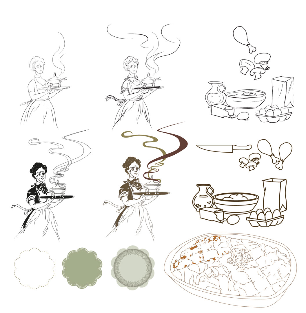
Some of my illustration development:
I chose to use photographs for the food examples. Here are the photos used:
Here is the completed recipe book
Cover, Back & Spine
Contents
Introduction
Recipe page 1
Recipe page 2
Showing posts with label Illustration. Show all posts
Tuesday, 20 September 2011
Thursday, 1 September 2011
Magazine Editorial - Double Page Spread
For this project, we got given 4-5 different articles.
The brief was to come up with an appropriate illustration/drawing for the article we chose and create an editorial for a magazing of our choice.
I chose an article that deals with the issue of emo culture and the article was tittled:
Slaves to the Anguish by Lin Sampson and designed it for One Small Seed magazine.
I immediately had ideas flowing.
The idea I thought works best, was literally being slaves to anguish (pain, sorrow, hurt, etc)
So I came up with two main drawings:
One where scalpels/knifes (anguish) were beating two emo kids
and the other was where scalpels/knifes (anguish) were being pulled on a carriage by slaves (emo kids).
I prefered the second idea and then took it further in photoshop using a graphics tablet.
Because this is a triple spread, it would be better and more acceptable for the image to be on the left with the text on the right following onto the 3rd page. Here I flipped my image horizontally to accommodate this and thereafter added my heading right above where my body copy will start:
For my body copy, I stuck to One Small Seed’s
futura style and for the heading, I used two
fonts that matched the emo/gloomy style
I was going for:

Here are my 3 proposed layout options, all in One Small Seed specifications:
Final Double page spread:
The brief was to come up with an appropriate illustration/drawing for the article we chose and create an editorial for a magazing of our choice.
I chose an article that deals with the issue of emo culture and the article was tittled:
Slaves to the Anguish by Lin Sampson and designed it for One Small Seed magazine.
I immediately had ideas flowing.
The idea I thought works best, was literally being slaves to anguish (pain, sorrow, hurt, etc)
So I came up with two main drawings:
One where scalpels/knifes (anguish) were beating two emo kids
and the other was where scalpels/knifes (anguish) were being pulled on a carriage by slaves (emo kids).
I prefered the second idea and then took it further in photoshop using a graphics tablet.
Because this is a triple spread, it would be better and more acceptable for the image to be on the left with the text on the right following onto the 3rd page. Here I flipped my image horizontally to accommodate this and thereafter added my heading right above where my body copy will start:
For my body copy, I stuck to One Small Seed’s
futura style and for the heading, I used two
fonts that matched the emo/gloomy style
I was going for:

Here are my 3 proposed layout options, all in One Small Seed specifications:
Final Double page spread:
Subscribe to:
Posts (Atom)


