Vetch’s Pier. After research and talks with the members, it is obvious that their number
one priority is to ensure future get to enjoy the recreational activities and
water sports offered. This will be my main focus and to create more awareness
of this problem. I will also show their Professionalism by constructing a
well-balanced logo, for the DPSC and the Save Vetch’s Beach campaign.
I chose to do combination mark logos, for its effectiveness and aesthetic
value. The Paddles combined with the word ‘SKI’, should easily read as
Paddle Ski, even though the words, ‘Durban’ & ‘Paddle’ are visible. I also
decided on adding the exact coordinates of the club and for its nature to
water sport.

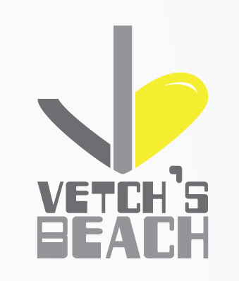
For the Vetch’s Beach logo, it clearly displays the letters ‘v’ & ‘b’, combined
by a heart and also shapes an anchor, which goes with the water sports
theme.
Stationery:

Signage:
For the actual Durban Paddle Ski Club building, a simple and striking sign will replace the old one, with added Save Vetch’s Beach campaign logo:

The save Vetch’s Beach logo, will also be seen on signs and billboards as
the following:

An Accoridian Z-Fold (8 side)
After much reading and gathering of information, the DPSC brochure will have the following inside:
* A brief History and what they are all about.
* Some tips on Paddle Skiing and where to buy one.
* Vetch’s Beach information along with the development plans.
* Contact information


Website:
The DPSC website I kept fairly simple, but much more striking and modern.

Vehicle & Clothing:

No comments:
Post a Comment