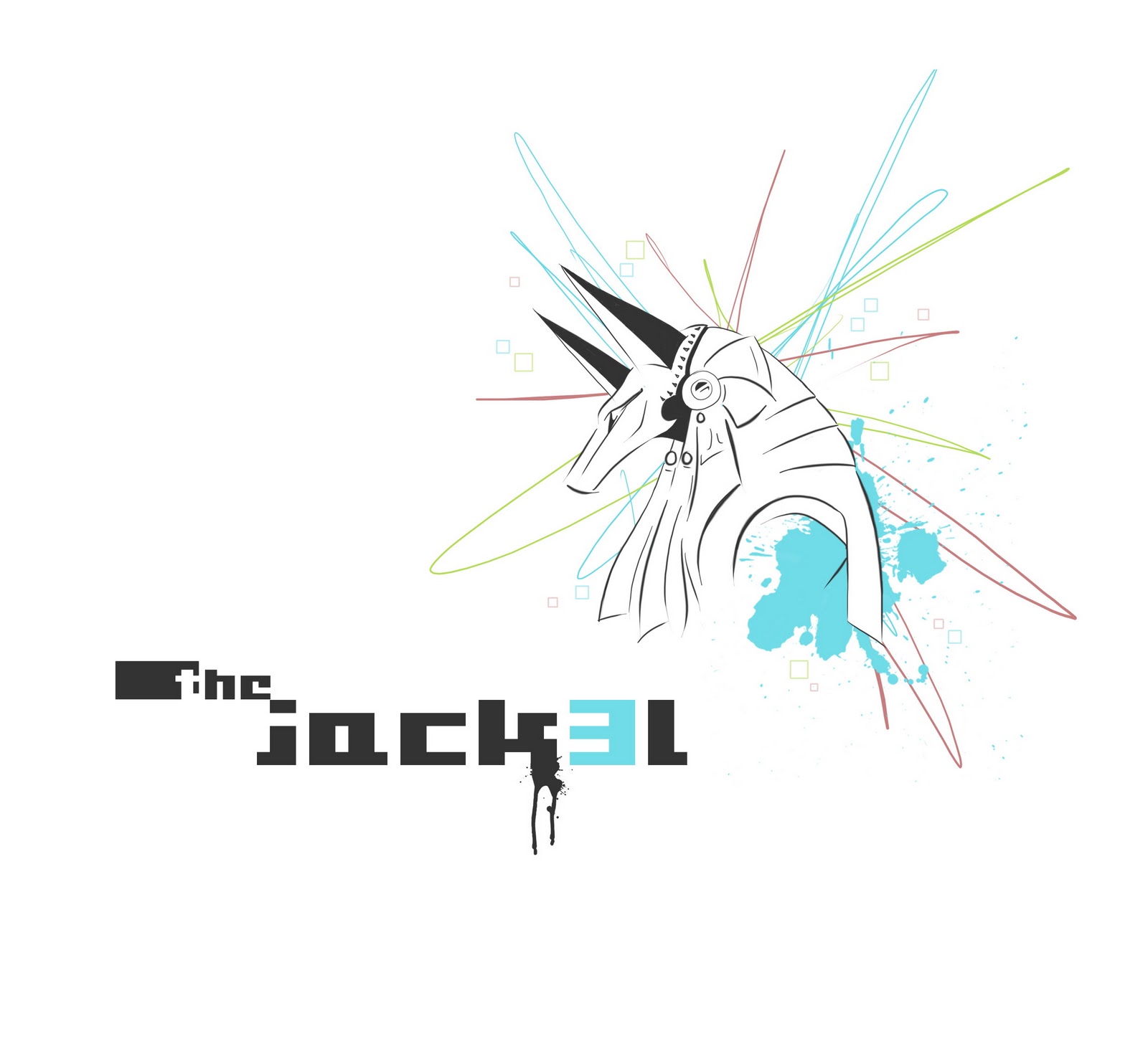
Tuesday 25 October 2011

Self Promotion

Self promotion is the aim for this project, and to create an image for yourself. A full corporate identity is required, a promotional item and a creative Curriculum Vitae. These should put emphasis on your strengths and style.

Logo:
For my logo, I decided to not just go with my name, Jacques Hoffman. A name or alias I have used for many years, the jack3l was more appropriate as all my e-mail addresses start with the.jack3l......
and my blog is named jack3l designs. It was originally used as a gaming alias and abbreviated from Jacques (JACK). Added inspirations for this logo (name) are:
Gaming, Anubis (Jackal headed egyptian
God), Color and Drawing.

Here is the development of my logo:


Final Logo:


Corporate Identity:


Creative CV:
For my creative CURRICULUM VITAE I was inspired by good layout and type that compliment each other.
I also liked the idea of having my text at a 30’ degree angle.
Having lots of information, this needed to be subtle and easy to understand.
My format was standard A4, but double sided.

This A4 sheet folds into a perfect 105mm square.
With imagery on the front, back and inside, it guides and informs the reader what it contains as opened:


Promotional Items:
I will have two promotional items, a t-shirt and a mouse pad.
A t-shirt is still a very effective item for promotion and a mouse pad is needed by everyone today
and certainly all designers.

The main illustrations on these items will tell the story and define the jack3l.

The first will define the meaning of a jackal:
One of the main and unique characteristics of a jackal is it’s endurance.


The next illustration will define the creativity and design element of the jack3l and especially the  logo. The word doesn’t exist and shows creation and matches the ‘ance’ of the other words shown.


The last illustration is another difining element of the jack3l and the gaming influence.
It shocases the performance and fun side of my character.


For the t-shirt design, minimal text will be used, but and added QR code will be on the back, which can be scanned with most phones today and will then take you straight to my blog site.
The design will be on a white t-shirt and will be as follows:


For the mouse pad design, it will have an inverted color design to the t-shirt, as a darker mouse pad
is nicer to look at and keep clean. Important contact information will appear on the bottom of the pad.

The design will have two variations:


Tuesday 20 September 2011

20 Sec Video - Global Warming

When I read the brief for this project, I wanted to either use Global warming or
The loss of bio diversity (habitat and species).
I ended up only using Global Warming.

My first 2 ideas were more based on animation and how we hold the world in our hands.
It was very literate and would show actual hands holding a polystyrene ball painted as the earth
with flames emited off every now and then until the hands are burnt so badly that it cant hold
the planet anymore and drops it to its doom, burning away to a crisp.

That idea would be a little boring so I came up with my final idea,
which is more humorous & ‘cheesy.’

It would show a cheesy guy in tight swimming trunks, with no care in the world getting ready
to go for a swim. Putting thick sunblock on his face and diving goggles on his head, he would make
his way to the pool doing some stretches. With his trunks pulled up into his but and showing some cheeks, he would do a magnificent swan dive only to then fall face first into an empty, hard pool.
Basically it means Global warming has got to the point where there isn’t even any water
due to the Sun drying it all up. :)

I didin’t add any slogan or catch frase at the end as it is quite obvious and done in a popular MTV style.

I had various styles in mind when we got this project. At first I wanted to do animation, but
finally settled with stop motion.
Once I had my idea, I planned each scene for the video. I want the viewer
to be held with the message for about 4-5 seconds, so my video had to be 15-16 seconds.
The ideal speed for me would be 10 frames per second (fps), so I would need about
150 - 160 photos.

All the frames were shot with my Canon 500D on
f - 6.3
exp - 1/200 sec
iso - 200 (last 3 frames on 200)
The editing I did in Sony Vegas 10.
Music used - Mischief Brew - 07 - Swing Against The Nazis.
The resolution - 1920 x 1080 (300mb file) & 720 x 480 (70mb file)
Frame rate rendered - 15 fps.
Format - .mov & .mp4

Some of these frames are duplicated in the video to enhance its effect.
On the last frame, the MTV & CONE logos will appear.


Finally
Here is the Video (click on Youtube icon for better viewing)


Special thanks to Chris Buckles for his awesome modelling skills
and Andrew Fouché for lending an extra hand :)


Recipe Book Design

For this recipe book project, I chose to design an A5 book.
I find that a smaller book is easier to work with while your cooking and doesn’t take extra space,
whether it’s on the counter or in a cupboard.

The theme of my recipe book is vintage, so I wanted to capture a true essence of age and classic beauty.
There are 3 main fonts that I used:


Some of my illustration development:


I chose to use photographs for the food examples. Here are the photos used:


Here is the completed recipe book
Cover, Back & Spine


Contents


Introduction


Recipe page 1


Recipe page 2


Thursday 1 September 2011

Magazine Editorial - Double Page Spread

For this project, we got given 4-5 different articles.
The brief was to come up with an appropriate illustration/drawing for the article we chose and create an editorial for a magazing of our choice.
I chose an article that deals with the issue of emo culture and the article was tittled:
Slaves to the Anguish by Lin Sampson and designed it for One Small Seed magazine.

I immediately had ideas flowing.
The idea I thought works best, was literally being slaves to anguish (pain, sorrow, hurt, etc)
So I came up with two main drawings:

One where scalpels/knifes (anguish) were beating two emo kids
and the other was where scalpels/knifes (anguish) were being pulled on a carriage by slaves (emo kids).


I prefered the second idea and then took it further in photoshop using a graphics tablet.


Because this is a triple spread, it would be better and more acceptable for the image to be on the left with the text on the right following onto the 3rd page. Here I flipped my image horizontally to accommodate this and thereafter added my heading right above where my body copy will start:


For my body copy, I stuck to One Small Seed’s
futura style and for the heading, I used two
fonts that matched the emo/gloomy style
I was going for:


Here are my 3 proposed layout options, all in One Small Seed specifications:


 Final Double page spread:


Wednesday 31 August 2011

Vitamins for Seniors - Dispenser

Pill Dispensers / Bottles are no problem to open if you're 23 years old, but for a senior over the age of 50 that might be suffering from arthritis, it can be near impossible.

A redesign was in order for a dispenser for everyone.

1.    For any senior, esspecially arthritis sufferers, it can be difficult and complicated
    to open medication bottles / dispensers. My aim was to formulate a vibrant,
    very easy to use and understand tablet dispenser.
    > Only one movement needed to dispense tablet.
    > Bright colors, so its always visible and easy to find.
    > No efford and no bending of fingers needed.
    > Safe for a family home, no sharp edges or detatchable parts.
    > Can be stored on kitchen counter and used daily without having to
        pack away in cupboard.
    > Fully recyclable.
    > Clear and big type on dispenser.

2.    For this tablet dispenser, the price would be a little more than the average container.
    It is driven by a mechanism inside for the release of the tablets and would add
    to the production cost. The average 200 tablet dispenser in this class, costs around
    R350 - R500. Cutting the need for packaging, as the dispenser is it’s own package
    and only has 3x stickers on it, the price would be R400 - R450. Its a very unique design
    and is definately worth the price. It is 100% recyclable plastic and if approved by the FDA,
    refillable at local pharmacies.

3.    The Dispencer is a semi rounded square shape with a soft rubber top that is
    gentle on any hands. The rubber top is pushed down easily and the mechanism inside
    releases a single tablet for every push. The tablets are released at the front bottom for
    ease of use with one hand.

 First roughs / ideas for dispenser.

Best ideas taken further into die-cut illustrations and finalised.

 3D Composition of final Vitamin Dispenser


Labels and Instructions.


Packaging - Doughnut 5Pack

When you think of buying some doughnuts, whether it's from Checkers, Spar or Woolworths, the packaging you get it in, isn't very appealing in any way.

For this project, I chose to redesign a 5 pack doughnut package for Woolworths.
I Chose this brand, because I enjoy the modern / clean look they strive to achieve and because their current packaging for this product isn’t very appealling.


1.    When I think of a doughnut pack, I think of fresh, colorful and visible doughnuts.
    So the first thing is to design a package that displays the lovely doughnuts that
    are inside. The doughnuts’ must be emphasized by sense.
    > Striking contrast between colors, so it stands out from shelf. I used Woolworth’s
        current style of bright color on black.
    > Clean and legible type on the packaging.
    > Cut out window to see and smell the contents inside.
    > Embossed type and imagery that enhances touch.
    > Shaped package to hold contents snug and more efficiently.
    > Possibility for series in this style, eg. Different characters and Colors.
    > Very easy and fast to assemble / disassemble.

2.    This new doughnut package design will have many advantages to any other predecessors.
    > Much more pleasing to look at.
    > Appeals to a bigger audience.
    > Fully recyclable.
    > Temps all human senses.

3.    Usage of the packaging is easy and effordless.
    > Can be stacked effectively in store for point of sale and promotion.
    > Easy to fold for staff and customers.
    > Less bulky and flimsy than previous bakery box designs.
    > Easier to disassemble and fold smaller for recycling.

First roughs / ideas of package.


Final package design die-cut illustration and further developed.

Final Design.

3D Illustration of Final Package Design.


Thursday 16 June 2011

Photolyric

Music that always inspires me and that I find has some of the most interesting lyrics, is the music by
Fokofpolisiekar.

The song ‘Tygerberg Vliegtuig’ inspired me with the words
‘skaap mentaliteit’ (1:23).
Translated it reads ‘sheep metality’, and this is exactly the mentality of our
society today. This immediately reminded me of all the hype thats been going on around Blackberry
smartphones. Almost every second Tom, Dick and Harry has one today and if you dont, you are either
a social outcast, a loser or you hate Blackberry.
This has become a trend that is followed especially by young girls today.
My shoot will be themed by this mentality, with 5 young, trendy girls having a picknick outside in a
beautiful nature setting. All five of the girls will be too busy on their Blackberries to actually enjoy the
picknick for what it is. There will be a plate in the middle with some dried grass and two of the girls will
actually have grass in their mouths like sheep. The picknick basket will also subtlly reveal Blackberry
boxes inside. This is ‘sheep mentality’.
The girls are a group of friends I know, that truely follow trends like sheep! I asked them all to help me
out for this shoot and they all gladly agreed. Their makeup was done by themselves before they arrived
at the shoot. The location I chose for this theme, was a medium sized open field across from Varsity
College in Westville.

Because of a tight schedule both me and the models have, a small 3 hour window was available to
shoot this scene. This was between 13:00 - 16:00. The shots I took that is the final photo, was at 14:00.
This is not the most ideal time of day, as the sun is quite harch, but it worked out very well.
I positioned the models in such a way that the sun won’t be directly in their faces and it actually gave a
nice rim lighting effect on the models.
For additional light, I used my build in flash and a reflective panel to reflect more light onto the models.

I was going to use a car battery operated light, but because of my hospitalisation, I couldn’t get hold of
one in time. The refecting sunlight looks very natural and probably works better anyway.

Images:
Here is where I was trying to get the correct settings on my camera for the scene and I played around
with some settings


Once I was happy with my settings, I had Andrew Fouche help me with the reflector.
This is when the sunlight is refected back at the models and with added camera flash.


Additional composition I shot just as a back up.


Best shots I considered for the Final Photo.


Just before Final Photo.


Final Photo:
Combining 3 photos, I created an HDR (High Dynamic Range) photo.
EXIF info:
Camera: Canon 500D
Aperture: f/10
Exposure: 1/80 + 1/125 + 1/200sec
ISO: 200
Focal length: 18mm


Planning and Diagrams:
Rough Sketches of what I had in mind for my photo:


Diagrams of the lighting for the photo:

Using ambient sunlight and car battery
operated strobe light.


Using ambient sunlight, the built in
camera flash and a silver reflector to
reflect the sunlight.


Behind the Scenes:
Some photos taken by Andrew Fouche and Vaughan Marais


Special thanks to:
Trevlyn Makkink
Shana Makkink
Lauren Berndt
Sinead Buckles
Kristy Wawa Grant

Corporate Branding - Durban Paddle Ski Club

The Durban Paddle Ski Club is an organization based at Durban Point,
Vetch’s Pier. After research and talks with the members, it is obvious that their number
one priority is to ensure future get to enjoy the recreational activities and
water sports offered. This will be my main focus and to create more awareness
of this problem. I will also show their Professionalism by constructing a
well-balanced logo, for the DPSC and the Save Vetch’s Beach campaign.
I chose to do combination mark logos, for its effectiveness and aesthetic
value. The Paddles combined with the word ‘SKI’, should easily read as
Paddle Ski, even though the words, ‘Durban’ & ‘Paddle’ are visible. I also
decided on adding the exact coordinates of the club and for its nature to
water sport.

For the Vetch’s Beach logo, it clearly displays the letters ‘v’ & ‘b’, combined
by a heart and also shapes an anchor, which goes with the water sports
theme.


Stationery:


Signage:
For the actual Durban Paddle Ski Club building, a simple and striking sign will replace the old one, with added Save Vetch’s Beach campaign logo:


The save Vetch’s Beach logo, will also be seen on signs and billboards as
the following:
Brochure:
An Accoridian Z-Fold (8 side)
After much reading and gathering of information, the DPSC brochure will have the following inside:

    * A brief History and what they are all about.
    * Some tips on Paddle Skiing and where to buy one.
    * Vetch’s Beach information along with the development plans.
    * Contact information


Website:
The DPSC website I kept fairly simple, but much more striking and modern.


Vehicle & Clothing: